You can add an unlimited number of Web Payment Buttons to your ReceivablesPro system. Watch the 2.5 minute video tutorial to see how it’s done. Detailed step-by-step instructions are provided below.
Follow the steps below to create a new Web Payment Button.
NOTE: Remember that you must have at least one Web Payment Page set-up before you can create a Web Payment Button. (See Add a Web Payment Page above.)
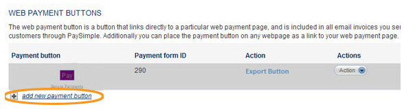
Click the “add new payment button” link at the bottom of the WEB PAYMENT BUTTONS table on the web payment pages dashboard.
The New Payment Button screen opens, as shown below.
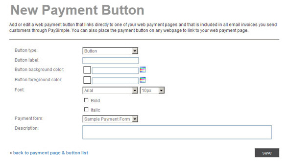
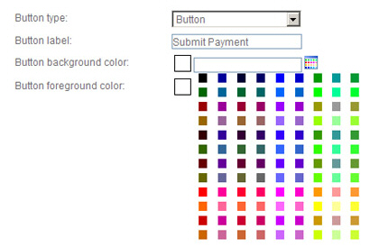
In the Button type drop-down box, select “Button” to create a graphic button, or “Link” to create a standard HTML link.
In the
Button label field, enter
the text you want to appear on your button. For example, “Submit Payment.”
NOTE: You can enter up to 60 characters,
including spaces.
NOTE: The button will automatically be sized to the length of the text.
If you want a more centered look, or if you want to right or left
justify the button text, enter spaces before and/or after the button
text. For example, to get 5 blank spaces before and after the button
text, enter “#####Submit Payment#####” (where # = a space).
In the Button
background color field, click the color palette icon to
the right of the field to open a group of color swatches from which
to select your background color.
NOTE: For “Link” button types, the background
color will be used to highlight the linked button text. If you want
the linked button to appear as plain text on the screen, leave the
Button background
color field blank.
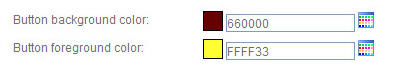
Alternately, enter a HEX color code in the field. (For example, 000000
is the HEX code for black.)
NOTE: There is not a swatch for white
in the color palette. If you want to set the color to white enter
“FFFFFF” in the field.
The swatch next to the Button background color field changes to display the color you selected. (If you entered a HEX code, the swatch displays the color you entered.)
In the Button
foreground color field, click the color palette icon to
the right of the field and select a swatch from the color palette,
or enter a HEX color code.
NOTE: The button foreground color will
be the color of the text in either a graphic or link type button.
When selecting a foreground color for a “Link” button, be sure to
select a dark color that will show up well. When selecting foreground
and background colors for graphic buttons, be sure that the text on
the button will be visible.
The swatch next to the Button foreground color field changes to display the color you selected. (If you entered a HEX code, the swatch displays the color you entered.)
In the Font field,
select the Font Face and
Size from the drop-down boxes.
Check the “Bold” box to use a bold typeface, and/or check the “Italic”
box to use an italic type face.
NOTE: Checking both boxes will result
in a Bold-Italic font face. Leaving both unchecked will result in
plain text.
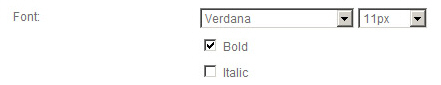
Font Face Choices: Arial, Comic Sans, Georgia, Times New Roman, Verdana. Arial is the default font.
Font Size Choices: 10px - 20px. 10px is the default size. A lower pixel size results in a smaller font size.
In the Payment form drop-down box, select the Web Payment Page you want to link to the button. The drop-down box will contain the Form name of each Web Payment Page created in your account.
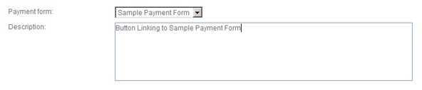
In the Description field, enter a description for the button. (Optional)
When you’re done configuring the button, click the “save” button to save it and return to the WEB PAYMENT BUTTONS table. Or, click the “back to payment page & button list” link to return to the table without saving the button.
The new button you just created is shown at the top of the WEB PAYMENT BUTTONS table.
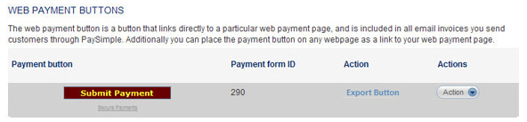
If you don’t like the way the button looks in the Payment button column, you can edit it and make changes to text, size, and colors. (See Edit a Web Payment Button below.) Once you’re happy with the button, you can export the button code and paste it into web pages and emails. (See Export a Web Payment Button below.)
