![]()
![]()
The snapshots section, located at the top of the Reports dashboard, provides a graphical depiction of transaction activity in your account by transaction type. These charts and the underlying data filters are not editable. Each time you view the Reports dashboard they are created as static graphics, which cannot be clicked to enlarge or drill down into data values.
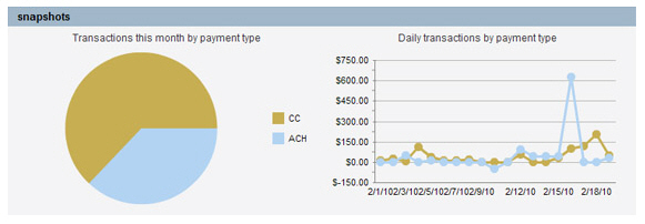
The Transactions this month by payment type pie chart breaks down transactions by number for both ACH and credit card, as follows:
The pie chart reflects the combined total number of transactions processed in your account for the current calendar month. Place your mouse over each section of the pie for the exact number and percentage of transactions represented.
The brown section represents that total number of credit card transactions, and the blue section represents the total number of ACH transactions.
The Daily transactions by payment type line graph breaks down transactions by dollar amount for both ACH and Credit Card in the current month, as follows:
The X axis contains individual days of the month. The chart will skip individual days as the month gets longer in order to fit in the display area. However, values for every day of the month will still be reflected in the chart.
The Y axis represents the total dollar value of transactions processed on an individual day.
The brown line represents credit card transactions and the blue line represents ACH transactions.
The charts will change dynamically as transactions are processed in your account. They will reset on the first day of each month.