![]()
![]()
The Quick Menu includes a summary section that provides a view-only summary of your settled payments and upcoming scheduled payments.
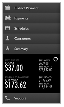
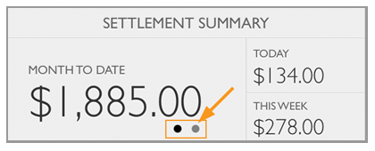
The SETTLEMENTS section
displays the net dollar value (payments less refunds) that were marked
as settled in your account for the current calendar Day, Week, and
Month. These values correspond to the Settlement
Summary section of the web-based application Dashboard.
NOTE: These values many not correspond
exactly with the deposits you see on your bank statement. For more
information on transaction settling and funding times, see Appendix F in the ReceivablesPro User Guide.
Today represents the dollar value for transactions (regardless of enter date) that were assigned a Status of “Settled” on the current calendar day.
This Week represents
the dollar value for transactions (regardless of enter date) that
were assigned a Status of “Settled” in the current calendar week.
NOTE: Week is calculated as Sunday -
Saturday
This Month represents the dollar value for transactions (regardless of enter date) that were assigned a Status of “Settled” in the current calendar month.
The SCHEDULED PAYMENTS section provides a sum of payments that will be generated by recurring schedules in the current calendar week, month, and year as defined below.
This Week represents
the dollar value for transactions that will be generated by payment
schedules in the current calendar week.
NOTE: Week is calculated as Sunday -
Saturday. As the week progresses and payments are generated this value
will decrease. It will reset each Sunday.
This Month represents
the dollar value for transactions that will be generated by payment
schedules in the current calendar month.
NOTE: As the month progresses and payments
are generated this value will decrease. It will reset on the first
of each month.
This Year represents
the dollar value for transactions that will be generated by payment
schedules in the current calendar year.
NOTE: As the year progresses and payments
are generated this value will decrease. It will reset on the first
of each year.
As you process transactions and enter schedules, either from the Mobile App or from the web-based UI, these values will update. To make sure you are seeing the most recent values, tap the refresh icon.

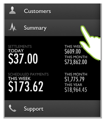
To access a larger view, along with a graph, of the information in the Summary, tap Summary in the Quick Menu.
The Settled Payments summary screen opens by default when you tap Summary in the Quick Menu. The top portion of the screen contains a bar chart, by month, for all settled payments. The bottom portion of the screen provides a summary of settled payments for the current month.
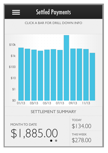
MONTH TO DATE sums the total dollar value of payments with a Settle Date in the current calendar month and a Status of “Settled.” Settled activity will increase as the month goes on and reset on the first day of the next calendar month.
TODAY sums the total dollar value of payments with a Settle Date on the current day and a Status of “Settled.”
THIS WEEK sums the total dollar value of payments with a Settle Date in the current calendar week (Sunday - Saturday) and a Status of “Settled” Settled activity will increase as the week goes on and reset on Sunday.
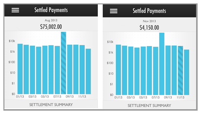
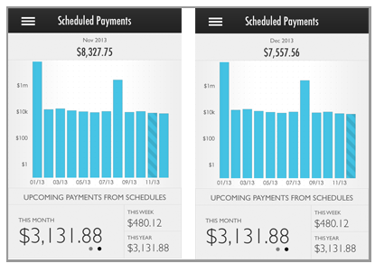
You can tap any bar in the chart to display the dollar
value represented by the bar. For example, in the screen captures below,
$75,002 settled in August 2013 and $4,150 settled in November, 2013.
NOTE: The value displayed for the current
month bar, will always match the MONTH
TO DATE total in the SETTLEMENT SUMMARY section. The SETTLEMENT
SUMMARY always displays the
current month totals, regardless of the drill-down in the top section.
The second page of the Summary covers scheduled payments.
Toggle to that page by tapping the second page dot.
NOTE: The first dot represents the Settled
Payments Summary and the second dot represents the Scheduled Payments
Summary. A black dot indicates the current page, tap the Gray dot to switch
to the other page.
The Scheduled Payments summary screen provides data for both payments already generated by schedules, and upcoming scheduled payments.
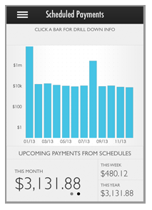
The bottom UPCOMING PAYMENTS FROM SCHEDULES section displays schedule activity that will take place in the future.
THIS MONTH is comprised of scheduled payments that have yet to be generated in the current calendar month. As the month progresses, this value will decrease as payments are generated. It will reset on the first of each month and begin counting down again.
THIS WEEK is comprised of payments scheduled for the current calendar week (Sunday - Saturday). This value will decrease as the week progresses and scheduled payments are generated. It will reset on Sunday.
THIS YEAR is
comprised of the remaining payments scheduled for the current calendar
year. It will decrease as the year progresses, and will reset on the
first of each year.
NOTE: The above screen capture was taken
in December, thus the values for THIS
MONTH and THIS YEAR are
equal.
The top portion of the screen includes a graph that
depicts the total amount of schedule-generated payments, by calendar month.
You can tap any bar in the chart to display the dollar value represented
by the bar. For example, in the screen captures below, $8,327.75 was generated
by schedules in November 2013 and $7,557.56 was generated by schedules
so far in the current month (December, 2013).
NOTE: The value displayed for the current
month bar, will not match the MONTH
TO DATE total in the UPCOMING PAYMENTS FROM
SCHEDULES section because the bar
chart depicts past activity and the UPCOMING section depicts future activity
Tap the triple line
icon ![]() in
the top-left header corner to return to the Quick
Menu.
in
the top-left header corner to return to the Quick
Menu.
NOTE: You can also flick the screen to the
right to access the menu.