![]()
![]()
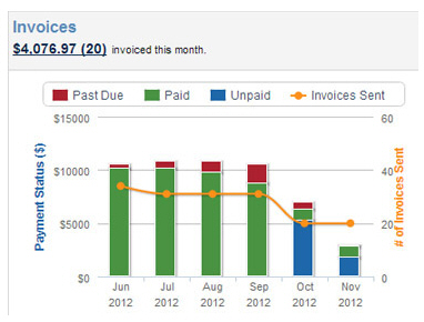
The Invoices chart is designed to provide an at-a-glance summary of your current month invoice activity, and the status of invoice payments over the past six months.
The summary values at the top of the chart provide a dynamic running total for the current month as follows:
The blue
dollar value is a summary of the current collectible totals for each
active invoice in the current month where:
Collectible Total = Invoice Amount
- Incentive + Penalty
The calculation dynamically updates as follows:
When an incentive period is active, subtract the incentive value
When an incentive expires (or is not configured), Incentive = 0
When a penalty triggers, add the penalty value
If
a penalty has not yet triggered (or is not configured), Penalty
= 0
NOTE: See About Invoice Incentives and Penalties in
Chapter 5 for more
information about invoice incentives and penalties.
The blue
number in parenthesis is the running total for the number of active
invoices sent in the current month.
NOTE: Draft invoices and invoices that
have been cancelled or deleted are not included in this total.
In the example below, it is November, 2012 and so far there have been 20 new invoices created in the month with a current total due of $4,076.97.
Click the blue link to go to
the manage invoices screen
with the Invoices table filtered
to display the invoices represented.
NOTE: This total includes invoices entered
individually and those generated by invoice schedules.
The bars in the graph are color-coded by invoice
status with red for past due invoices, green for paid invoices and blue
for unpaid invoices. They use the left-hand axis and represent the total
dollar value for each payment status based on invoices that were sent
in the indicated month.
NOTE: This chart is based on the original
invoice Send Date, if you resend the invoice it will not alter the calculation
in this chart.
The dollar values (sum of invoice balance for each Status) represented by these bars are dynamically calculated to take early payment incentives and late payment penalties into account as follows:
Unpaid
Component Calculation:
For the month represented, the sum of the current Balance on
all invoices sent in that month with a Status of “Unpaid” where:
Balance = Amount - Incentive (if any)
Paid
Component Calculation:
For the month represented, the sum of the total dollar amount paid
against all invoices sent that month with a status of “Paid.”
Total
Paid = Amount - Incentive + Penalty
NOTE: Depending on when an invoice
was paid, and whether penalties and/or incentives were configured,
those values may or may not apply.
Past
Due Component Calculation
For the month represented, the sum of the current Balance on
all invoices with a due date in that month and a Status of “Past Due”
where:
Balance
= Amount + Penalty
NOTE: Depending grace period, a penalty
may not initially apply to a Past Due invoice, but will trigger
over time.
Mouse
over any of the colored bar portions to see the exact amount. Click any
colored portion of the bar to go to the manage
invoices screen with the Invoices
table filtered to display the invoices represented.
NOTE: The bar graph values are allocated
based on the month in which the invoice is sent, NOT the month in which
the invoice was paid. For example, if an invoice was sent on June 1, but
wasn’t actually paid until July 1, the dollar amount of the payment will
be included in the June bar NOT the July bar.
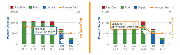
The orange line indicates the number of invoices sent over the six month period depicted in the chart. Mouse over the orange dot to see the exact number. Click the orange dot to go to the manage invoices screen with the Invoices table filtered to display the invoices represented.
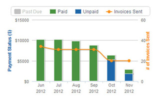
You can hide portions of the graph by clicking the chart label for the component you want to hide. This action will grey-out the chart label and remove that component from the chart. To restore it, click the greyed-out label. For example, in the screen capture below the Red “Past Due” invoices section is removed.
Next Section: Dashboard Overdue Invoices >